Thursday, April 26, 2012

Staging Your House the Feng Shui Way

Feng Shui is the ancient Chinese art of enhancing positive energy flow and the resulting effect it has on life.  By utilizing some basic techniques you can enhance how a home that is for sale will appeal to potential buyers.


Staging to Feng Shui the Sale

Add Light:  Soft light is best, and the bulb should not be visible.  Mirrors can also intensify light, but be careful with placement.

Banish Clutter:  Cleaning and de-cluttering increase the opportunity for money to flow to you.

Use Plants:  Live plants or a good representation of live plants signify life.

Wisely Use Color:  To avoid stress and irritability, use neutral colors around the house.  To lift the chi, add flashes of color in the art or accessories.

Clear a Path:  Keeping your pathways clean and unblocked allows the wealth to flow into your front door.  Make sure you trim and bushes or shrubs that overhang pathways.

Hang a Gentle Wind Chime:  A wind chime actives the sound energy, greets visitors, and draws chi to your house.

Get Packing:  Packing to move sends a positive intention: You expect to move, you expect to get a sale - and you will.

* Taken from "Home Staging for Dummies" Rae, Maresh

Wednesday, April 4, 2012

Mad Men Chic


Like many of you I rejoiced when Man Men finally returned to the airwaves last week.  Cocktail in hand, I breathlessly watched the new episode unfold and exclaimed, "great apartment!"  I was referring to Don Draper's new digs.  It seems that in the off season Don has gotten married, and with a new wife came a new Manhattan apartment.  It got me wondering, what would Betty think if she laid eyes on this new place?


With all of these Mad Men images brewing around in my head, I just had to create my own Mad Men inspired living room...
Sofa, Artwork, Lamp & Rug:  Crate & Barrel
Chair & Bar:  Design Within Reach
Coffee Table:  cb2
Pillows:  West Elm

Wednesday, March 21, 2012

Design Inspiration: Lonny Magazine


The editors and contributors at Lonny Magazine have produced yet another gorgeous issue that provides oodles of inspiration.  You can view the entire issue here, but I have put together some of my favorites that I wanted to share.


This room while beautiful, illustrates how a breakfast nook can be created in a very small space.  Design is so much about problem solving and finding a way to live in a home that you love.


I love the aesthetic of this room in general, but the faux moldings really make it pop.  These details are easily achieved using painters tape to mask the area and create the look of expensive mouldings.


I love this classic chair and it is perfect for one of my design clients.


I love the colors in this office, but I also am inspired to use tag boards in my own office to hand fabric, paint and wallpaper samples.

I love the graphic patterns and am contiually obsessed with sunburst mirrors.

This dresser is a very close match to the Ikea's Edland 5 drawer chest.  With a little bit of paint it could be a very close match, but at $299 for the Ikea version is a bargain compared to this $4940 price tag for this piece.

I hope my inspiration provides you with inspiration as well.

Wednesday, February 29, 2012

Painted Furniture Made Easy

Painting existing or purchased furniture can be a great way to save money and get exactly what you want.  

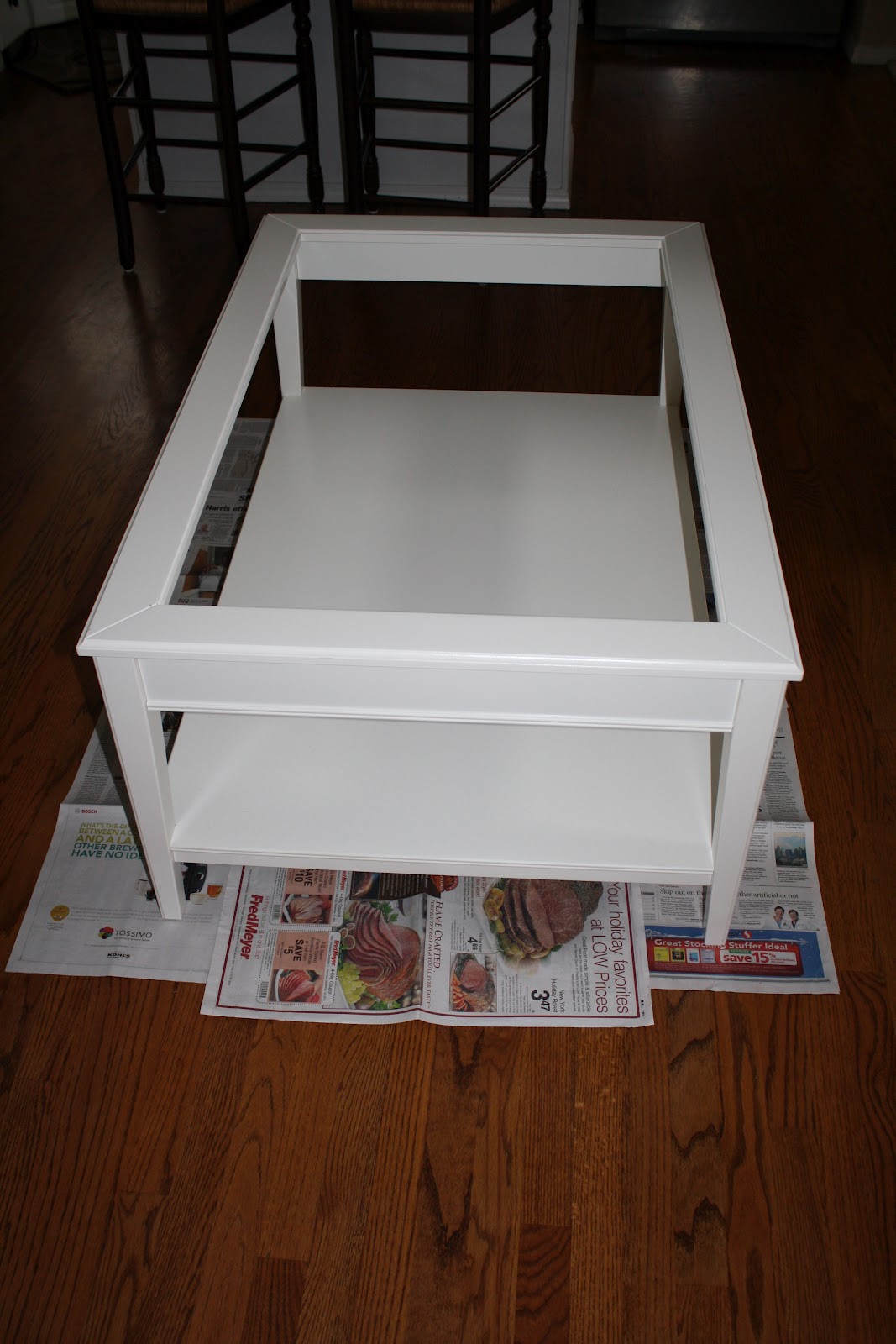
In this case we used an IKEA Liatorp coffee table that we purchased for only $199.  The lines of the table were perfect, but the white color was not going to work.  The price of the table allowed us to spend more on other more important elements of the room.


After attending a Benjamin Moore color trends seminar for designers last spring, I learned about a great new paint that would be the perfect choice for this project.  

It's called Advance and it provides all of the great qualities of an oil based paint with a easy water clean up. 

We began our project by removing the glass from the table and setting it aside in a safe place.  We then sanded the table with a fine grit sand paper and wiped the table with a damp cloth to remove any sanding residue.
After the prep work we were ready to get started painting.  It is important to use a good quality brush when using oil based paints to insure a smooth and desirable finish.  A great trick to get the right amount of paint on the brush is to place a rubber band around the paint can.  This allows you to dip the brush in the paint and easily run the brush against the rubber band to remove excess paint.
The paint itself went on extremely well.  Any brush strokes created during the application smoothed out as the paint settled and dried.  In around two hours our first coat was completed.
We let the piece dry overnight and applied another coat which provided a uniform finish.

Paint is a great way to make a statement with furniture, but also can be used to unify various pieces in a room in order to give a cohesive look.  I hope you feel confident and inspired to try this paint on your own project.

Tuesday, February 7, 2012

Luxe for Less


Would you believe you could take a $79 IKEA dresser and make it look like this?  Well that is exactly what you can do with a great new product called Overlays.  Overlays are fretwork designs that are made of composite material that can easily be applied to a variety of furniture pieces.  Overlays can be used to embellish new IKEA pieces or to "upcycle"an existing piece of furniture or a flea market find.  The results are impressive and the options are endless!


Check out this stylish copy of a classic Dorothy Draper Dresser.  The 1940's original (below) can cost as much as $4,000.  With a little time and effort you too can have the Luxe look for Less!


Monday, January 30, 2012

Ten Tips to Take Ten Years Off Your Home


It seems like every time I pick up a fashion magazine there is an article about how to look "10 years younger", and like many, I am a big believer!  I realized that this really holds true for homes as well.  So I compiled a list of all of the things that a homeowner can do to make their home appear more youthful and up to date.


Interior:


1. Replace your kitchen and bathroom knobs:  This is a quick and inexpensive update that       can really refresh the look of a space.  


2. Replace out of date door handles:  They should be simple in design and either brushed nickle or antique bronze.  


3. Get rid of any shiny fake brass:  This can be solved with a quick can of black or bronze spray paint.


4. Make sure your paint colors are up to date:  I have listed good paint colors to use in other posts.


5. Update your lighting:  New lighting is available at many of the big box stores and can be easily installed over a weekend.


6. Get rid of large plate glass mirrors in the bathroom:  Builders often put these in because they are inexpensive.  Taking them down is usually easier than you think, and your can find great inexpensive framed mirrors from places like Homegoods or Lowe's.


7. Minimize natural Oak:  This finish is out and has been out for a while.  If this is on a banister for instance paint it black.  Cabinets can be either painted or refaced for an updated look.


Exterior


8. Replace exterior lights:  Often another place builders will save money.  Change out these babies and you will not be sorry.


9. Put a new coat of paint on the front door:  This freshens up the look even if you stay with the existing color.


10. Power wash all exterior walk ways:  If you don't own a power washer you can rent one for the day.

Wednesday, December 14, 2011

Pantone 2012 Color of the year

Pantone has recently announced it's choice for 2012 Color of the Year.  For those of you who are not familiar, Pantone is the world-renowned authority on color.  In 1963, Lawrence Herbert, Pantone's founder, created an innovative system for identifying, matching and communicating colors to solve the problems associated with producing accurate color matches in the graphic arts community.  This innovation allowed those in creative fields, especially digital, to have a true match for colors across the board.  Each year Pantone chooses a color of the year and that choice effects trends we as consumers see in fashion, interior design and digital technology.  

The 2012 color of the year is Tangerine Tango.  It is a spirited reddish orange that inspires energy and vitality.  Expect to see this color moving forward in the next year and perhaps consider how you might incorporate it into your own home.  Pillows, bedding and table top accessories are all great options for ways to use this fun pop of color.